- date, issue and price underneath masthead of newspaper front cover
- more celebrity entertainment readable stories than world news
- feature stories similar to sell lines.
- rhymes used in the radio advert, and have a catchy memorable jingle
- use recognisable places for the pictures of the poster advertisment
Thursday, 8 March 2012
mini evaluation of research
After deconstructing local newspapers and some regional(the sun) I now have a clear idea of what I want to include within my newspapers, advert poster and radio advertisment like

Media Production 'photo shoot planning document'
What emotional impact do you want your photography to have upon the reader?
With my images I plan to make them interesting but realistic so anyone who saw the newspaper would be interested by the image without even reading the headlines or part of the story on the front page. Regarding my poster I want to create a kind of curiosity upon the reader, like get them thinking why did I use the location and how that links in with the newspaper.
What personal do you need? Who are you going to photograph? What props will you need?
I am using my group member so I will be photography her for our front page newspaper, we won’t need any dramatic props just like heels maybe a handbag etc. I will photograph her leaving a pub or restaurant, using an angle of a fast walk giving the impression she doesn’t want to be photographed. For my poster I don’t need to use a model just landscape so i can rely on myself to get the pictures taken. And I will photograph Sunderland’s town bridge and hoping to wait for the train passing to get in the background.
How are you going to emphasise colour?
Within my front cover of my newspaper I will emphasise colour when the pictures and text are all edited together as I want to create a dark fade around the main image then away from that section of the cover have brightness again in the advertisements and masthead etc. when editing my poster I will emphasise colour by changing the adjustments and levels to make the colour more dramatic. I could test out many different techniques on my images to see what works best like cross processing or different coloured overlays.
Have you briefed your model? What make up and costume do you need?
Myself and my model have planned the photo shoot so her more than anyone is a good person to use and she understand what images we need and how we want them to look. Make up we will use but not a lot but casual and we also may use sun glasses as its quite stereotypical for celebrities to be photographed coming out of buildings with glasses, heels, handbag etc.
The 'Recce'
Are there any potential hazards that could pose as a health and safety risk where your photo shoot will take place?
As I will be taking images for my newspaper front cover outdoors there a number of potential risks that could affect my health and safety. I will be taking pictures on location more than likely in busy places as I want to choose a building or bridge for example that represents the north east. By doing so there will be traffic etc. which I will have to be careful around.
What will you do to ensure these risks are minimised?
For my poster I will make sure I minimise these risks that could rise by being very careful when walking around on location I will make sure to be careful when around traffic, using road crossings near the bridge etc. depending on what story I feature on my front cover of my newspaper, if it is about and individual or a building i will make sure I am allowed to photograph and enter the buildings I use etc.
Will the time of day/weather affect the outcome of the photos? Have you allowed for this?
For my newspaper advertisement poster I will rely on the weather being dry and quite bright as rain and clouds would darken the image and make it more difficult to take the images. Although I could edit and lighten the images on Photoshop, which will still work but will take more time, therefore I am considered all types of weather. For my newspaper images the advertisement images and extra story images will only be small and mostly indoors therefore the weather won’t be an issue. For my main image I want to have a girl being photographed almost like paparazzi style coming out of a nightclub or similar building but with editing I could use a normal building during the day etc. so dark weather would be an advantage but however I can still get all of my images easily.
Have you considered the background to your photos, particularly if taken outside? How will you ensure you get the background you want?
The only image I will be using which has a relevant background is for my advert poster as i will be talking a sort of a landscape shot of the two bridges and the background will be the sky so whatever the weather is like will suit my image if it is cloudy edited the image will look more interesting and contrast. And if there is sunny weather then my image will be very colourful and bright, portraying a sense of happiness.
Have you considered lighting? What about the ‘problems’ of natural lighting either outside, or streaming through a window? Will you need to use a flash? Have you considered reflective objects that might spoil the effect?
Again all the lighting I will be using for my poster is natural lighting as it will be outside and i have said weather the weather is bright or dull I can take the image and edit it to what i feel is a good standard, I can also change the ISO and other settings of the camera to set the light filter to the correct camera settings. The main image of my newspaper i may need to use a flash as I want the picture to appear to of been taking at night time, but still a flash used to light up the person in the picture. There are no props that will be used in any of my images although if I used buildings etc. for example ‘the glass centre’ may show reflections but that shouldn’t be too distracting from the actual building.
Do you need to book time in a room?
I could use the photography studio at Shiney Row college as some of my images can be look high and low key as I need to gather all my own images for advertisements for the newspaper cover.
Are there other people/crowds likely to be an issue for you? What have you done to ensure that it will not spoil the effect?
More than likely crowds will be an issue for me when shooting pictures for my newspaper front cover and poster as i want to get well known and maybe even famous buildings but this may hard if there in the town centre as di need to take my images during the daylight when these places will be at their busiest. To ensure I won’t spoil this effect I can add the people to the pictures as it is news related images that involves people of the north east
Or I can simply wait for a chance to get a clear picture which will be less time effective.
Are you reliant on lifts/props/friends/equipment/models? How have you planned that these things will come together at the appointed time? Plan B?
As I have chosen to create the newspaper, advert poster and radio advert I only need to rely on myself to get the work done, I don’t need any props or equipment only a camera which I own and can use at any time. The only thing I need is one model and as I am working in a group with one more person there is no problem when taking the pictures. I don’t really need a plan B as I have considered everything that could be risks or would prevent me from getting on with creating my newspaper like weather etc.
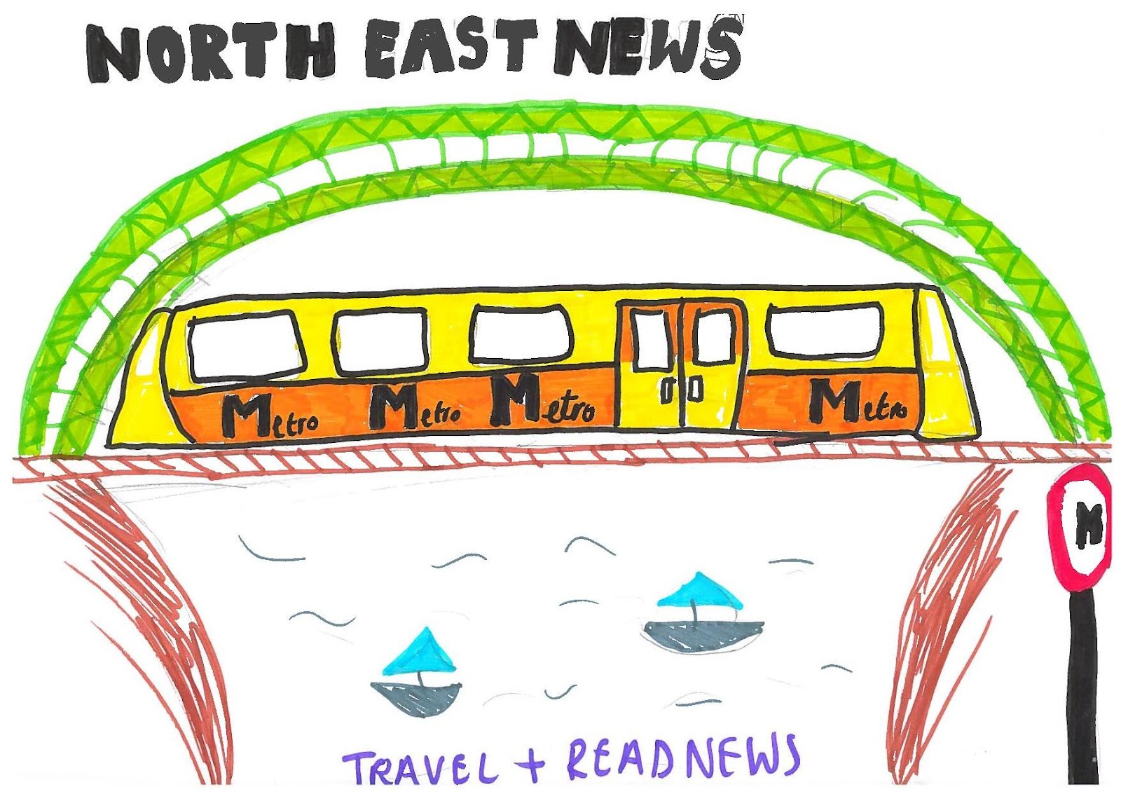
The whole idea of my advertisement poster is that the public who would usually read the newspaper but are to busy during the day can read whilst traveling fitting their daily fix of news in with day to day things. This is a rough drawing of the Sunderland’s town bridge which also has a brown bridge behind which the trains use. ‘Metro’ the reason I have chosen this to advertise the North East as the metro train is well recognised for public transport within the north east especially Sunderland and Newcastle. Along the bottom i will have a tag line suggesting read and travel at the same time, and along the top I will have the newspapers logo making it easier for people to recognise and associate the two with each other.

This is the flat plan for my newspaper front cover, my mast head will take up the full length of the top section of the page it will be called Sunderland local or North East news something that people will easily recognise the newspaper as a north east paper. The small box on the top right corner is where the date and issue will be displayed so people can see how new or old the newspaper is. Underneath the mast head is a thick bar which takes the length of the page again this is for the adverts which realistically if my newspaper was published this is how it would make some of its profit. The section at the right side of the page is for smaller story’s that a featured in the paper. The section along the bottom is where I will show one or two paragraphs or the main feature story which will encourage people to buy the magazine and read on. For my main image I have used buildings as I was unsure about the main story I would use but I have decided to use the story of a celebrity coming out of a restaurant or nightclub as the social story’s appeal to a bigger audience.
Research images


Typical image's that can be found on local newspapers, especially sunderland and newcastle is very much pictures of local buildings, advertising them or already well know buildings. The first picture is an image of the newly built part of sunderland university. this seems slightly more polished and professionally edited for a newspaper but I like these types of images as it gibes the cover more style and quality.
The second picture is an image of Sunderland's well know winter gardens, this image also slightly more stylised than a normal newspaper image, I say its different as I find a lot of the images to be less saturated in colour and quite grainy, although this could just be the quality of the paper used. As with both pictures here they are just more colourful than a front cover and second page main image, although the layout, framing and composition of the images are relatively similar to newspapers. Although for the university image I would have had more traffic and students in the frame to make it seem more busy and realistic.

The main image of this front cover is quite gripping as anyone who would of knew Jade or was her fan etc. would be generally shocked by this image or anyone who didn’t know her would have also been shocked at the image. I think they would have achieved this reaction from the stark contrast from a black background shadowing very close to her head the quite a high key image used making the fact that she has no hair sand out as the full head is bright, which is unusual for a front cover of a newspaper. Although there are other small images they are very small and distanced from the main image, they also lack colour this is suggestive that although they are also stories (articles) featured in the newspaper they’re not too distracting then we automatically know the woman who takes up the majority of the cover is big news and what is important and is the main story of this newspaper. The layout of this cover I think is very effective as the bright red of the logo and the white and text section only takes up a small section and arguably looks irrelevant to the main story. The way the main image is placed I think is a good position to have it in the bottom corner as with the dark black and slightly framed by the headlines it seems totally detached from the rest of the newspaper. Again the colour scheme I think is effective as there is a big difference with the black and the bright image, to the dull section on the left side where the paper advertises other stories. Then to the logo part of the cover which takes up 1/5 of the page is again portraying brightness about the paper as the headlines and the other colours are sad and unhappy stories the brightness of the sun gives the audience/public the reassurance that buying this newspaper is still an enjoyable read. I think necessary information is placed rather well the main story is about Jade which takes up the majority of the centre of the page and the font that is used is bold and rather plain but it is clearly read and can be seen from a distance. I think the genre of this newspaper is quite open but compared to other national newspapers this one (the sun) is known more for entertainment eg. Real life stories like a take a break magazine etc.
Although I do think that the small text box in-between the main headline ‘jade: my cancer has spread’ is quite irrelevant and more conventionally would be found along the bottom of the page, as its distracting and takes attention away from the headline and image. although this may be the effect the editor wanted to achieve so the audience would read the first part of the story and want to read on.
Again with the font I think the logo that is used is conventional as it is issued in every sunewspaper and it is colourful and bold, it is also a recognisable logo which people will automatically go and pick up as it is advertised so much.
Subscribe to:
Posts (Atom)