Thursday 10 May 2012

EVALUATION Q4

How did you use new media technologies in the construction and research, planning and evaluation stages ?

When competeing my research and planning and creating my products i used new media technologies by using the internet, photoshop and premire pro.


this is a screen shot of when i was editing my radio advert by using this new media technology i was able to edit my recording changeing the time it starts end etc. here i was editing the time the recording started as when i recorded it the sound didnt start till a few seconds in. After i used the same programme to add pictures that id used throughout my work to convert the sound into a video to be able to upload to youtube then to be added to my blog.


I aslo used photoshop to create the rest of my work newspaper front cover, second page and advertisement poster as it has many different features like editing photo's but then i was able to input text and transform text into logo's etc.

EVALUATION Q3

What have you learned from your audience feedback ?
From this section of my audience feedback from my advertisement poster I can see where i could have made improvements with making the trees lighter and text bigger but I also think my poster is realisticly a good advertisment poster. I tried changeing the levels when editing the poster in photoshop but it changed all the other levels of the image like over exposing the sky etc. As for the text it could have been clearer butthe bottom right corner blends so well with the colours and the theme of the poster i didnt want the text to stand out too much.

There was a lot of the same feedback i got from my poster for my second page newspaper like the image being too dull and leading to low quality but again i tried brightening the image but it changed the whole picture however i realise my image could be lighter. I also realise i need to add to the bottom of my newspaper as the framing and composition looks off from the way the page dosent seem to fit a A3 scale. I also got some good feedback about the smaller image i used as it linked the poster and newspaper together by using the same image, also about the contact details and advert section  as my audience feedback said it makes the page for realistic and believable.

Alot of my peers commented on the picture I used and said it was unclear,grainy etc. but i can jusitfy this as i edited the picture to look like this to create the effect of new journalism where as the journalist/editors get pictures from the public from low quality cameras and mobile phones etc, so when the image is blew up to the scale it is bad quality. as it matches the story line of a high celebrity who dosent want to be photographed hence the compostition of walking and not facing the camera directly. Other things that my peers commented on was how my text is unclear but like all conventional newspaper the text is very small maybe even smaller on the front cover but again its just the paper my work was printed out on as when the cover in open in photoshop we can read the text perfectly. The audience seemed to think that the strip of advertisements and feature stories was a good idea as its a common conventiona again making my newspaper more realistic.

Evaluation Q2

How effective is the combination of your main product and ancillary texts ?

The combination between my main products and my ancillary is very effective as I took a lot of ideas from all of my deconstruction texts and the ancillary texts i have chose to use for my evaluation are the ones that i think are very similar and have similar conventions.

The gazette's newspaper front cover i got ideas from using a bar and quite noticable section of the newspaper for advertisements, i think i have been succesfull in using this convention as it allows people with different interests to the main story to still buy the newspaper. again the colour scheme is different colours but i still kept to a minimun colour scheme to stop the front cover looking clutterd and messy.

The second page of the newspaper I feel I Got a lot of my ideas for the Journal newspaper as it had adverts on aswell as weather and still had room for a short story. which from the first opening page of a newspaper is quite unconventional as its usually items promoting the newspaper or selling pages etc. so here i combinded all of my research from my second page deconstructions and used contact details, weather adds and proted my own oline newspaper website whilst still having a main story which i think worked well.

Thursday 3 May 2012

Evaluation Q1

In what ways does your media product use, develop or challenge forms or convention's of 'real media' products ?
My media product challenges the conventions of many real media products as if differes from other local newspapers as it is slightly more stylised than local newspapers in the way that it's stories can be compared to 'the sun' with celebritised stories. Although I have stuck to the stereotypical compostion of the newspaper as all of the research deconstructions I used seemed to have the same format. for example: I wanted my masthead to be easily memorable as a logo rather than text.


By acheiving  this simple masthead I feel like if my product was to be produced in the 'real world' it would stand out and be recognisable like larger newspapers (the sunderland echo's masthead ^). Other parts of my newspaper shows the conventional narrative types that are always on newspapers like the stereotypical sub stories and advertisments, showing feature stories to widen the interests and appeal to a bigger target audience.
Although I have went into more detail with my feature stories than the 'real journal newspaper' I feel like it was relavent as I took a risk when changeing (challenging) the theme and narrative of a conventional newspaper, By having strongly edited images and entertainment rather than usual town news. The second page leans more to the Local newspaper stereotype as its a story about saving the local church this can be compared with Christopher Vogler's the hero's journey.

I can apply this theory to my work as the story has the same characteristics as Cristopher's Vogler's hero journey as it starts out with call to adventure which is when the hero is faced with a problem or challenge in my work this would te public as a group trying to save the church, then other conventions of this theory is meeting the mentor, ordeal etc. this is where they would plan the matter ahead then the ordeal of the problems the public may face trying to save the church before returning to the elixir which is a form of acomplishment, normaily and equilibrium.

Wednesday 2 May 2012

FINAL PIECES


Radio Advert

Advertisment poster images


Advert for first page Newspaper


Like many on the newspapers I used for my research deconstructions on all of the second page's had advertisments, I think this can benefit newspapers as it givedd them the chance to make money by advertising for companys/buisness's and also free advertising for themselves. e.g. this is my advert that I created using photoshop which will take up half of my second page. if my newspaper was to be distributed in the 'real world' this would be free advertising space for my own company newspaper and would lead people to engage more with the newspaper also with web 2.0 leaving their opinions and comments, and with smartphones downloading apps, this is why i think my advert is effective as it relates to new technology bringing in a younger audience.

Church


More realistic of a Local newspaper to have local buildings with stories like save our church etc. This picture has a good compostion asd there is no other buildings around this one to distract the audience and we can cleary make out that the building is a church before we seethe headlines etc.

Prom front cover image


This is the picture I used on my front cover for the prom section, I personally think it is more effective tan having one or two people from a prom or a teacher or school building showing as this seems to have more of an impact on the reader, as in what it would mean to have no more proms. The scale of how many people attend this event and the effort they go to lends a bit of sadness if the event was to be stopped.


Prom Article

Schools within the north east of England claim that after 2012 proms they will be lucky to  have anymore. With cuts by the governments in schools and college’s they say they will find it extremely difficult to be able to cover the costs of a prom. Although the students already contribute its just not enough. Students say there happy to pay more towards there prom as they don’t want to not have the opportunity to celebrate school and have one last night with their friends.

This is the sub story that continues into the newspaper, conventional for all newspapers.

Main Story Article

Reality TV star Abby Stevenson has confirmed rumours that she will be the newest edition to the BGT (Britain got talent) talent show. The star rose to fame after the first series of miss north east where she won the modelling competition and won a contract with Max Factor.  Sources say that Simon Cowell has wanted the model for the new judge for months and says she has a good eye for talent, as she is also a musician. N the modelling competition they also had to have a talent Abby’s was she could play piano, guitar and sing. The new Judge says she’s looking forward to the auditions in the north east and will find some ‘pure’ talent to take to the finals. Late last night when Abby was seen leaving the train in her local nightclub sources say : she’s always drinking and is not fit to be a role model for TV, she may soon be ‘uncontrollable’. The model/musician said this is untrue she’s just enjoying herself after months of constant working but she is very much her normal self. Last year’s winner holly Ravenswood is also due to appear as a filling in judge for some of the shows later on in the series while he reality TV star is unavailable due to work, again holly is from the north east who won using her talent for singing and dancing.

This story  think works well in the way that it balances equally between local news (citizen) and an entertainment read.

Feature story's images


These are feature stories picture's the reason I chose to use both these images as they are realistic normal picture's that any member of the public could take.  Although the idea sounds stupid a lot of people walk there dogs alone in fields where they feel comfortable yet gives them the oppotunity to be attacked, which if the newspaper qas to be produced a lot of people could relate to. The picture of the Aquatic center I think is relavent in the time that I have created this news paper, it is a new well know building within Sunderland and with London's 2012 Olympics lends again the realism that the stories are real and interesting.

main image


This is the main image I will be using for my front cover newspaper it seems at first to be quite grainy and saturated but I edited this as it was a good quality image and i thought it looked unusually out of place against the background as it was too bright of an image. As my newspaper was more reality entertainment than international news etc. I decided to take my images based on newspapers like 'the sun' and to have a well know celebrity figure for the front cover, but as it had to be a local newspaper made the famous girl from the north east. To fit my chosen theme I shot the the picture like a paperazi styled photo, as in a a lucky shot to be taken, and aswell as a lot of newspaper now use public journalism photo's that can be bad quality as there took on camera phones etc.

progress

Now I have finnished my research and have put together my ideas and flat plans I now need to:
  • Take images for the front cover, second page and poster
  • Plan radio advertisment
  • write stories lines and adverts, sell lines
  • get peer assesments of final work
  • make improvements
  • complete evaluation

Target Audience

What conventions do you plan to keep regarding the visual construction of your text, main images of print work, sub-images, the title, font-use, textual elements (choice of lexis) and colour palette? Do you plan to change any of these? If so why, and how will they appeal to the target audience?  Where you are referring to how your text is going to be similar/dissimilar to other texts of the same genre please refer to specific examples & styles.
When taking my main images I plan to stick to original conventions like a bold title which will be in the largest text on the page, I will use a thick simple font as i will edit the masthead to have outer glow's ad drop shadows on photoshop, also some font's can be hard to read and some may give off the wrong impression to the audience e.g. the Daily express has a curled sophisticated font and is associated with more intellectual reading and audience for an older target audience, where as the sun is bold clear and plain   , targeted at a bigger audience as an easily readable newspaper. Again my main image will be to the right side of my front cover and covering most of the top half of the second page, this is quite regularly used on the local newspapers I have used for my deconstructions, this seems to work well with the public as the centre images is easily seen as the main story etc. My colour palette I can compare with my AS coursework as I will use the same technique as my music magazine which is to stick with a maximum of three main colours so my magazine looks professional and not too distracting with a lot of colours.
How would your product likely be produced and distributed if it were to be produced for sale or distribution in the ‘real world’? How do you know that this text fits a place/niche in the market that would sell to and who produces/distributes similar texts…which texts, to whom [target audience] and with what success?
If my product (newspaper) was to be produced and distributed in the real world I think it would be produced as an easily  entertainment sort of read newspaper that would be popular and distributed locally around the north east. Entertainment meaning it would be less of an political news and more reality town people's stories. I think that there is a place/niche or my newspaper and a similar text i can compare it too is the more regional newspaper 'the sun' as it seems to be a mixture as reality and less political views and stories. My stereotypical target audience would be 20 years - 45 year olds as I think there interested to read about stories they can relate to, as for the older generations I think they'd be less interested in the news I would be producing. 
Who is the target audience of your text? Try to be as specific as possible in terms of demographic information: gender, ages, characteristic behaviours regarding shopping, media consumption, social and entertainment habits, market segmentation, socio economic category etc. You should be able to characterise them in terms of these behaviours ?
The target audience for my newspaper is quite open ranging from 20 - 45 years I think that it will sway more towards the females as it will be a lot of reality reading and stories about day to day life, and a lot like a magazine with infomation on tv and celebrities etc. The audience again dosent have to be of a certain grouping as the newspaper ranges from many genres.  
What is going to make them watch/purchase/return to it?
The thing that is going to make the audience purchase my product firstly is that I will be creating a newspaper that caters for many different types on interests and genre's. The front cover will be filled with feature stories, advertiments and sell lines so that the newspaper can suit different peoples interestes within my chosen target audience.

Thursday 8 March 2012

mini evaluation of research

After deconstructing local newspapers and some regional(the sun) I now have a clear idea of what I want to include within my newspapers, advert poster and radio advertisment like
  • date, issue and price underneath masthead of newspaper front cover
  • more celebrity entertainment readable stories than world news
  • feature stories similar to sell lines.
  • rhymes used in the radio advert, and have a catchy memorable jingle
  • use recognisable places for the pictures of the poster advertisment

Media Production 'photo shoot planning document'

What emotional impact do you want your photography to have upon the reader?
With my images I plan to make them interesting but realistic so anyone who saw the newspaper would be interested by the image without even reading the headlines or part of the story on the front page.  Regarding my poster I want to create a kind of curiosity upon the reader, like get them thinking why did I use the location and how that links in with the newspaper.
What personal do you need? Who are you going to photograph? What props will you need?
I am using my group member so I will be photography her for our front page newspaper, we won’t need any dramatic props just like heels maybe a handbag etc. I will photograph her leaving a pub or restaurant, using an angle of a fast walk giving the impression she doesn’t want to be photographed. For my poster I don’t need to use a model just landscape so i can rely on myself to get the pictures taken. And I will photograph Sunderland’s town bridge and hoping to wait for the train passing to get in the background.
How are you going to emphasise colour?
Within my front cover of my newspaper I will emphasise colour when the pictures and text are all edited together as I want to create a dark fade around the main image then away from that section of the cover have brightness again in the advertisements and masthead etc. when editing my poster I will emphasise colour by changing the adjustments and levels to make the colour more dramatic. I could test out many different techniques on my images to see what works best like cross processing or different coloured overlays.
Have you briefed your model? What make up and costume do you need?
Myself and my model have planned the photo shoot so her more than anyone is a good person to use and she understand what images we need and how we want them to look. Make up we will use but not a lot but   casual and we also may use sun glasses as its quite stereotypical for celebrities to be photographed coming out of buildings with glasses, heels, handbag etc.

The 'Recce'

Are there any potential hazards that could pose as a health and safety risk where your photo shoot will take place?
As I will be taking images for my newspaper front cover outdoors there a number of potential risks that could affect my health and safety. I will be taking pictures on location more than likely in busy places as I want to choose a building or bridge for example that represents the north east. By doing so there will be traffic etc. which I will have to be careful around. 
What will you do to ensure these risks are minimised?
For my poster I will make sure I minimise these risks that could rise by being very careful when walking around on location I will make sure to be careful when around traffic, using road crossings near the bridge etc. depending on what story I feature on my front cover of my newspaper, if it is about and individual or a building i will make sure I am allowed to photograph and enter the buildings I use etc.
Will the time of day/weather affect the outcome of the photos? Have you allowed for this?
For my newspaper advertisement poster I will rely on the weather being dry and quite bright as rain and clouds would darken the image and make it more difficult to take the images. Although I could edit and lighten the images on Photoshop, which will still work but will take more time, therefore I am considered all types of weather. For my newspaper images the advertisement images and extra story images will only be small and mostly indoors therefore the weather won’t be an issue. For my main image I want to have a girl being photographed almost like paparazzi style coming out of a nightclub or similar building but with editing I could use a normal building during the day etc. so dark weather would be an advantage but however I can still get all of my images easily.
Have you considered the background to your photos, particularly if taken outside? How will you ensure you get the background you want?
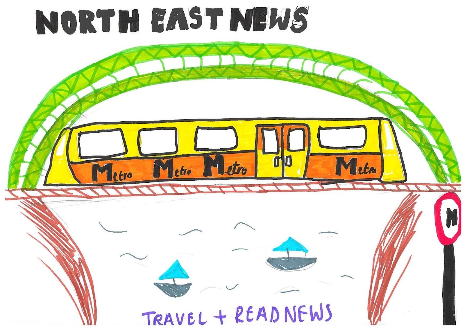
The only image I will be using which has a relevant background is for my advert poster as i will be talking a sort of a landscape shot of the two bridges and the background will be the sky so whatever the weather is like will suit my image if it is cloudy edited the image will look more interesting and contrast. And if there is sunny weather then my image will be very colourful and bright, portraying a sense of happiness.
Have you considered lighting? What about the ‘problems’ of natural lighting either outside, or streaming through a window? Will you need to use a flash? Have you considered reflective objects that might spoil the effect?
Again all the lighting I will be using for my poster is natural lighting as it will be outside and i have said weather the weather is bright or dull I can take the image and edit it to what i feel is a good standard, I can also change the ISO and other settings of the camera to set the light filter to the correct camera settings. The main image of my newspaper i may need to use a flash as I want the picture to appear to of been taking at night time, but still a flash used to light up the person in the picture. There are no props that will be used in any of my images although if I used buildings etc. for example ‘the glass centre’ may show reflections but that shouldn’t be too distracting from the actual building.
Do you need to book time in a room?
I could use the photography studio at Shiney Row college as some of my images can be look high and low key as I need to gather all my own images for advertisements for the newspaper cover.
Are there other people/crowds likely to be an issue for you? What have you done to ensure that it will not spoil the effect?
More than likely crowds will be an issue for me when shooting pictures for my newspaper front cover and poster as i want to get well known and maybe even famous buildings but this may hard if there in the town centre as di need to take my images during the daylight when these places will be at their busiest. To ensure I won’t spoil this effect I can add the people to the pictures as it is news related images that involves people of the north east
Or I can simply wait for a chance to get a clear picture which will be less time effective.
Are you reliant on lifts/props/friends/equipment/models? How have you planned that these things will come together at the appointed time? Plan B?
As I have chosen to create the newspaper, advert poster and radio advert I only need to rely on myself to get the work done, I don’t need any props or equipment only a camera which I own and can use at any time. The only thing I need is one model and as I am working in a group with one more person there is no problem when taking the pictures. I don’t really need a plan B as I have considered everything that could be risks or would prevent me from getting on with creating my newspaper like weather etc.
The whole idea of my advertisement poster is that the public who would usually read the newspaper but are to busy during the day can read whilst traveling fitting their daily fix of news in with day to day things. This is a rough drawing of the Sunderland’s town bridge which also has a brown bridge behind which the trains use. ‘Metro’ the reason I have chosen this to advertise the North East as the metro train is well recognised for public transport within the north east especially Sunderland and Newcastle. Along the bottom i will have a tag line suggesting read and travel at the same time, and along the top I will have the newspapers logo making it easier for people to recognise and associate the two with each other.
This is the flat plan for my newspaper front cover, my mast head will take up the full length of the top section of the page it will be called Sunderland local or North East news something that people will easily recognise the newspaper as a north east paper. The small box on the top right corner is where the date and issue will be displayed so people can see how new or old the newspaper is. Underneath the mast head is a thick bar which takes the length of the page again this is for the adverts which realistically if my newspaper was published this is how it would make some of its profit. The section at the right side of the page is for smaller story’s that a featured in the paper. The section along the bottom is where I will show one or two paragraphs or the main feature story which will encourage people to buy the magazine and read on. For my main image I have used buildings as I was unsure about the main story I would use but I have decided to use the story of a celebrity coming out of a restaurant or nightclub as the social story’s appeal to a bigger audience.

Research images


Typical image's that can be found on local newspapers, especially sunderland and newcastle is very much pictures of local buildings, advertising them or already well know buildings. The first picture is an image of the newly built part of sunderland university. this seems slightly more polished and professionally edited for a newspaper but I like these types of images as it gibes the cover more style and quality.
The second picture is an image of Sunderland's well know winter gardens, this image also slightly more stylised than a normal newspaper image, I say its different as I find a lot of the images to be less saturated in colour and quite grainy, although this could just be the quality of the paper used. As with both pictures here they are just more colourful than a front cover and second page main image, although the layout, framing and composition of the images are relatively similar to newspapers. Although for the university image I would have had more traffic and students in the  frame to make it seem more busy and realistic. 

The main image of this front cover is quite gripping as anyone who would of knew Jade or was her fan etc. would be generally shocked by this image or anyone who didn’t know her would have also been shocked at the image. I think they would have achieved this reaction from the stark contrast from a black background shadowing very close to her head the quite a high key image used making the fact that she has no hair sand out as the full head is bright, which is unusual for a front cover of a newspaper. Although there are other small images they are very small and distanced from the main image, they also lack colour this is suggestive that although they are also stories (articles) featured in the newspaper they’re not too distracting then we automatically know the woman who takes up the majority of the cover is big news and what is important and is the main story of this newspaper. The layout of this cover I think is very effective as the bright red of the logo and the white and text section only takes up a small section and arguably looks irrelevant to the main story. The way the main image is placed I think is a good position to have it in the bottom corner as with the dark black and slightly framed by the headlines it seems totally detached from the rest of the newspaper. Again the colour scheme I think is effective as there is a big difference with the black and the bright image, to the dull section on the left side where the paper advertises other stories. Then to the logo part of the cover which takes up 1/5 of the page is again portraying brightness about the paper as the headlines and the other colours are sad and unhappy stories the brightness of the sun gives the audience/public the reassurance that buying this newspaper is still an enjoyable read. I think necessary information is placed rather well the main story is about Jade which takes up the majority of the centre of the page and the font that is used is bold and rather plain but it is clearly read and can be seen from a distance. I think the genre of this newspaper is quite open but compared to other national newspapers this one (the sun) is known more for entertainment eg. Real life stories like a take a break magazine etc.
Although I do think that the small text box in-between the main headline ‘jade: my cancer has spread’ is quite irrelevant and more conventionally would be found along the bottom of the page, as its distracting and takes attention away from the headline and image. although this may be the effect the editor wanted to achieve so the audience would read the first part of the story and want to read on.
Again with the font I think the logo that is used is conventional as it is issued in every sunewspaper and it is colourful and bold, it is also a recognisable logo which people will automatically go and pick up as it is advertised so much.

Wednesday 7 March 2012

The Gazette Deconstruction

The reason I chose to use The Gazette as one of my deconstruction is, obviously it’s a local North East newspaper but I wanted to compare the good and bad sections of this newspaper to my newspaper ideas as I defiantly want to use the same layout and composition of this front cover. Underneath the masthead the box that is used for advertisements I think is a good contribution to the front cover as it lends colour within the cover, also it fills up the page rather than having too much text. Again I like the composition of the top of the page with the masthead, price and date very close together with the advertisements although I would even out the sections by having the title(masthead) the same length and width of the advertisement section. This front cover image is effective I think as it is heavily outlined by sell-lines and the headlines. Arguably the colour seems saturated but obviously as it seems to be a good quality images, makes the audience wonder why? is it to blend in with the rest of the dulled colour scheme.  Again like the Journal and the Sunderland Echo I feel my newspaper front cover would benefit from having smaller stories (feature stories) as it would open the target audience and appeal to more people.
Second page
This is a slightly different second page in comparrison to the other local newspapers I used for deconstructions as it has less advertisements in weather etc. Although it still leaves a small section for advertiseing houses for rent-sale, this gives reassurance of reality to readers(audience) that cant relate to the local stories. In the Bottom right corner there's a 'twitter logo' this showing that we can follow this newspaper and new news updates online, also this may be one of the papers advertisments as it gives recognision to the social networking site. Arguably by showing this twitter logo it could suggest a younger target audience for the Gazette newspaper, as it is a interactive website using the web 2.0 which is used more by a younger audience (30-)
More conventional the middle section of the page with the one main image for the first story not being too crowded with images as there always seems to be a lot of text on the first page. The idea I get from this first and second page is to use a similar compostion and layout as he top half of the front cover and use the same story and advertisment settings as the second page.

The Journal deconstruction


 The image positioned on the top half of the page, this is effective as apart from the masthead and the framing of the news paper the picture is the onlyI think that the front cover of the Jorunal's newspaper is very well constructed in the way that the framing is clearly outlined with the top and bottom bar thats also used for text which is a good idea as the writing then has to be large and bold catching the readers attention easily. I like the structure of the page haveing the main  thing the audicence has to focus on is the image which advertise's the main feature story of the newspaper. The blue lion like icon that comes after the masthead I like I think it is a good idea as it acts as an advertisment for the newspaper a the icon can be used on various posters etc. and readers would know that it was the Journal's newspaper. The idea I get from this is to create a realisticly recognisable logo to the local audience. For my front cover of my newspaper I want a seperate section on the bottom half of the page for a different story which seems just as interesting and has as much importance as the main story. Although this paper seems to have two stories I think it could be confusing and missleading to the reader as to at a quick first glance it would be hard to tell whuch headlines match the which story. Again I want to use the right section of the page for smaller stories or a similar type of section for advertisments etc. this will be effective as it will make my newspaper more realistic as this seems to be a more noticeable convention with the newspapers front covers. The colour theme of this newspaper works well as its simple but adds enough colour to the paper so it dosent look dull and uninteresting.

The second page of the news paper is very stereotypical for the second page as it has one long section that takes up the full length of the page, which is used for a type of contents page aswell as advertisments, I dont want to use this convention but I still want to section the page which will appeal to a bigger target audience.  The top half of the page I get ideas from I like the way the full story takes up half of the page with a big enough image but a good amount of text without having to carry the story onto another page. I like the idea of having a weather advertisement although I think it would be more time effective to have some other advertisement at the bottom half of the page as it would be difficult to acheive a cartoon like weather picture. Although the weather section of the newspaper is apparent in every newspaper printed therefore I think that it should match the theme colour of the newspaper which is red that way it will seem more proffesional and as if a more reliable source. Although I think I will use the bottom half of this page and replace the weather report with more advertisements for my own newspaper.
 
With this local newspaper I like first of all the masthead used it is large and bold and easily recognisable for a distance, underneath the title in smaller font this the issue date and price which all newspapers have to have displayed clearly,  a feature that will be on my front cover of my newspaper. I also like the thick box across the top half of the page which I would like to use for advertising more adverts than stories, as if my paper was to be published this would what would be on a stereotypical newspaper and it’s also a way to make money within the news industry. Although I dislike the way the image is along the bottom of the paper I would like to have a smaller headline and have the main image in the centre of the page as I feel I would grab the audience’s attention more. Again I dislike all the colour that is used as I feel it is very distracting and it is easier to concentrate on the main feature of the magazine if the paper sticks to set themed colours, this also gives a more professional look to the magazine.  I like the fact that a small section of the right side of the page is used for text and images (sell lines) of what’s inside the paper i think this is a good addition to the front page, as people who may not be interested in the main article may be interested in one of the smaller stories.
 This poster is more international than a local newspaper poster but I like how there is a image used with text and the title of the paper. Also there is a small headline with part of the story which will appeal to a big audience and if anyone interested in David Cameron or not if they read the first part of the article and are interested they most likely will go and buy The Sun. Although this has all the conventions of a newspaper title, headlines and images we can clearly see it is a poster which i also like as it looks very professional. Again the same colours and fonts are used to link the poster to the newspaper its self. The ideas i get from this poster is to add the price and issue date to the poster, obviously so the public audience can see when this story is published, that if the poster focuses on one specific story, and showing the price, because if the newspaper was to be for sale realistically the prices are very similar for each newspaper and competitive, and having a smaller pice would appeal to a bigger audience.

Sunderland Echo Deconstruction


First of all I like the framing of this newspaper and I will like to use a similar layout with the masthead in the same position as this one, then with the layout nearly the same as this one with the dates and advertisements etc below the title. Although there is only a small image used i want to have my main picture taking up more space in my main section of my front cover. The colours used are
conventional as they stick to minimum colour not to distract the audience, but is still attractive to the public. I want to have the same sort of composition of this newspaper it is simple yet effective. The image that is used on this front cover is very strong and the meaning can change from each reader, although it is effective whilst getting the audience’s attention as the tubes etc that are in the image raises questions and the reader looks deeper into the image trying to find more clues to the meaning of the picture, until the buy the newspaper and read the article. I want to have a strong image like this, rather than one that the audience will overlook. I think have the small articles down the right side of the page is a good convention to use as it appeals to a bigger audience. For example if someone wasn’t interested in the main story they may see another featured story in the newspaper or an advertisement they want to read about and buy the newspaper.
 
This is a quite old newspaper advertisement poster, although it has a very simple design its matches with the theme of the newspaper and would be quite easy design. To the public (audience) it is very easily recognisable to the readers of this newspaper as it has the same font used on the headlines and same masthead. The colours used black, white and yellow are the colours used on the newspapers front page, again linking it with the daily voice newspaper, and even people who don’t read the daily voice will be able to recognise which newspaper this is from as we have the masthead clearly shown, therefore if they’re interested in the story the can go and buy this news. The thing I like about this poster is I would also like to have the title take up 1/3 of the page, and having writing on my poster although i also want to have images that represent the north east.